
Every year or so, it seems that I feel the need to change the layout of my website. As I approach the 5-year mark of notneelpatel.github.io, I wanted to take everything I learned in website design and put it into the best website that I could design.
Some general thoughts and constraints that I had going into it were the following:
The website must be written in HTML, CSS, and Markdown. I don't really want to use anything more than that. This keeps the website minimal but also means that I have to be creative with certain elements if I want to add dynamic elements.
The website must have a functional blog system + blog engine. I decided that I want to improve my C++ skills so I rewrote my blog engine from scratch, moving away from Python. As part of a "functional blog system", I want my blogs to be readable. Taking inspiration from the literal design of books and the words of Paul Graham, I noticed that books are always justified width and many of them do not have very long lines. Just like best practices for good code is to not have lines that exceed 80 chars, I want to make sure my website follows a similar rule. I also noticed specifically in the older iteration of my website that the moving background made it hard to read the blog posts.
There isn't much about me or my personality in previous versions of my website. I can list things like music I like, books I'm reading, anime/shows I like, and write more. I want to also be motivated to continue to update these things, perhaps it may be a roundabout way to hold me accountable to continue working towards a goal if I'm having a hard time making it a habit.
Design and Aesthetics
I began by visiting as many interesting websites as possible to get a general idea of what kinds of elements of websites that I liked. I wrote notes, studied the CSS, and copied bits and pieces of websites.
I want to shout out a few websites that inspired me in particular:
- https://ampersand.pm: There are many parts that I really liked, like the alligator, and how there's a lot more that meets the eye. You can see I took a lot of inspiration from this one in particular when I designed my home page.
- https://sweetfish.site: There's a lot to love about this website. For me, the cohesive design is what is the most special to me.
- https://moonlit.panko.zip: Not much of the aesthetics influenced my final design, but this website reminded me how fun websites can be if you choose to add bells and whistles.
- https://ribo.zone: I really like how they basically made their website a point-and-click adventure.
A few descriptive words that I kept seeing in all my website inspirations were:
- retro
- dithered (for images)
- minimal
- textured
Other inspirations
I'm slowly working my way through the book "Making Decisions" by Robert Heller. It is a DK book which means every page almost looks like an "I Spy" book but with educational text sprinkled around.
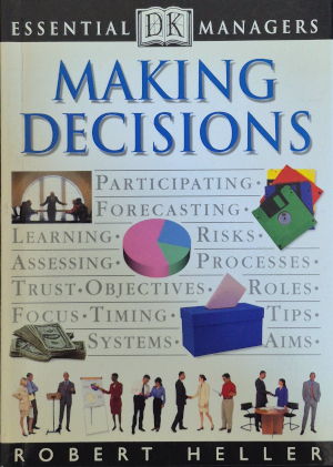
Book cover of Making Decisions by Robert Heller
"Utopian Scholastic" is the term that can describe the aesthetics of DK books. Going down that rabbithole, it reminded me of a peculiar box art style that I've seen.
To anyone who is even remotely familiar with 80s game consoles, you may know about the Sega Master System. While I don't think I'll ever play a Master System game in my life, I will forever appreciate their box art. Distinguishing themselves from Nintendo, the Master System's box art features a grid background and often blue serif text, consistent with the majority of the catalog.
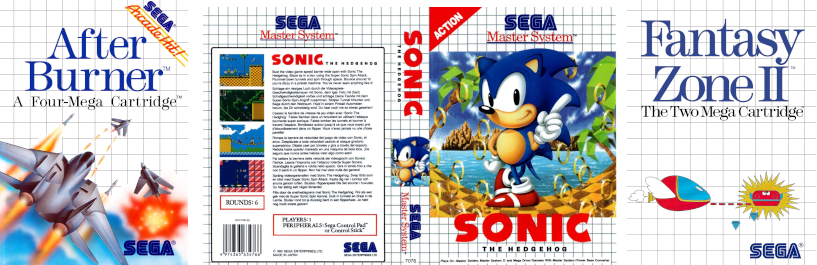
Master System Box Art for After Burner, Sonic the Hedgehog, and Fantasy Zone II
As you can see around this web page (assuming I didn't change it again), you can see just how much the Master System's box art design inspired me.
Starting the design
I started planning out a new website design all the way back in August. Back then, I didn't really know what I wanted the design to look like or how it should look, so I kept trying different things. I was mostly struggling with a layout and fonts. It wasn't until I discovered Utopian Scholastic that I got unstuck. The Sega Master System box art inspired me to try replicating its style with my own twist for a website.
Another thing that helped me immensely was talking to my friends about the design, asking what they thought of it, and seeing how it could be improved. I had an initial design that I was sort of on the fence about before going down the Master System path. That design did not seem to compel my coworkers at all, so that was all I needed to see to know the design wasn't a winner.
As I kept developing it further, it got a lot easier for my friends to give poignant feedback: suggestions to change the background, what to do with empty space, etc. This really helped tie things together and give it some extra polish. I want to thank my friends Aashna, Amilesh, Lauren, Liam, and Nathaniel for helping out with this stage.
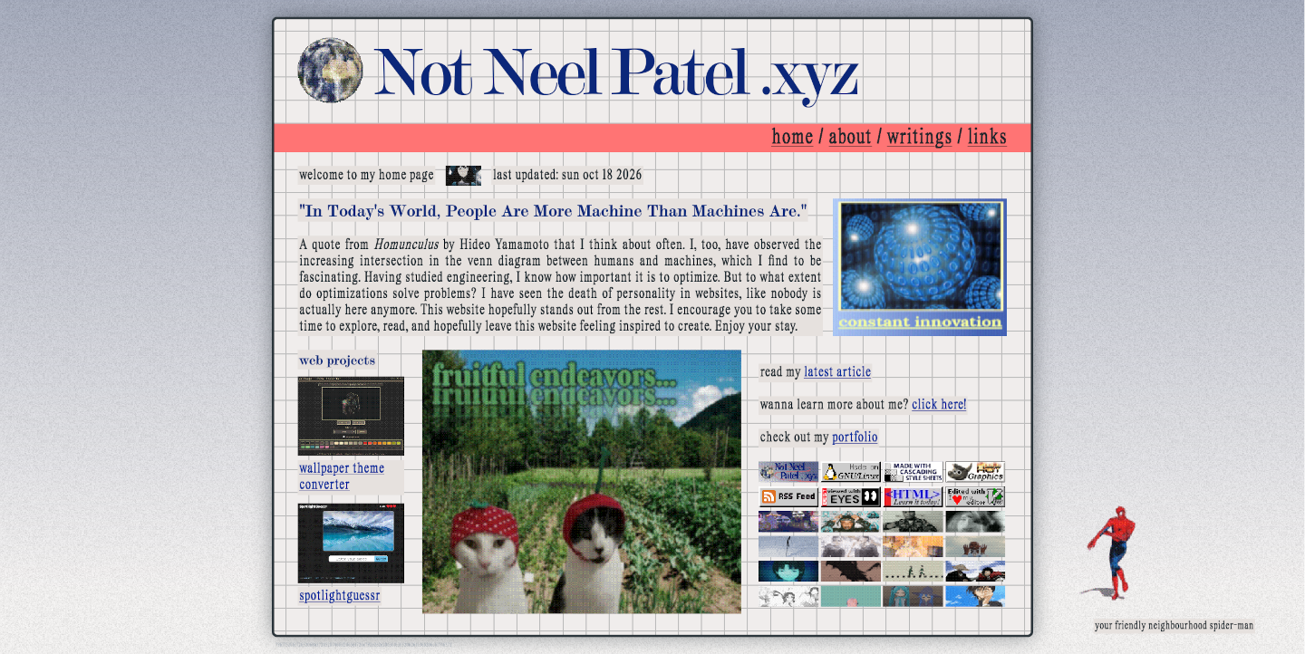
New design
Static Site Generator
The other major part of this website redesign is the static site generator. I wrote it from scratch not only so that I can practice C++, but also so that I can finally properly deploy my website. Prior to this, my blog engine would just update the source code with the generated HTML files. It made for a very brittle system that is hard to revert if I made changes. For example, if I ran the engine multiple times while editing a blog post, then it would add multiple entries. Not only that, but technically anybody could visit the source markdown files on the website, which was not intended.
It's best practice to have a build/deployment be separate from the source, like how proper programs should. The website repo should only consist of the source code, and because I don't really want to manage a CMS, my writings written in Markdown as well.
You may wonder why I didn't just use an existing static site generator. I agree that the existing solutions are probably 10x better than mine, but this one is mine and it's actually not that hard to make a site generator. The most challenging (moreso tedious) part is converting markdown files to HTML. I initially tried writing a markdown to HTML converter in C, and had a decent proof of concept, but eventually abandoned it in favour of md4c. It has been fun developing this engine since it's a simple project.
The static site generator is not only responsible for converting writings
markdown files to HTML, but also augmenting some of the files in a couple ways.
With the writings, there is a table of contents that is generated by searching
for <h3 and <h4> tags, generating an id for it, and linking it to the table
of contents. Image captions are also generated from the alt text. In addition to
the writings, a writings.html page is also generated, sorting in
reverse-chronological order. In the future, I will also re-attach the RSS feed,
but as of writing, that is in the works.
For index.html, there are two things that get updated: the latest article
(which just takes the first element of the list of writings), and the last
updated, which injects the current date (at build time).
GitHub Actions CI
In order to keep the source separate while also deploying onto GitHub Pages, I wrote a few GitHub Actions scripts to run builds whenever I push code. Firstly, for the static site generator, I have a GitHub actions runner compiling a binary of the static site generator. I'm thinking this will eventually automate new releases of the static site generator as well. Releases are important as the GitHub actions runner needs to pull from there to build my website on my website's repo.
For my website, it first pulls the static site generator binary from its
releases, builds the website, then deploys the out/ directory to GitHub Pages.
Et voila, we have new content on notneelpatel.xyz!
Overall thoughts on design
I'm pretty happy with this design, but I have a feeling that I will grow to dislike it in the future. I'll enjoy this blissful time while it lasts, as nothing lasts forever. Have you designed a website? What challenges did you face? Want to share your website with me? Email me at contact[at]notneelpatel.xyz !!
Epilogue: Commentary on the state of websites
If you actually look at the work that I did over the past 2 months, then you would quickly realize that this could've be done in a single day, had I used a coding agent. Using AI to do this whole thing probably would have saved many hours, however it results in something that just isn't authentically mine.
Programmers especially haven't seem to have caught on that their vibe-coded frontends look vibe-coded from a mile away if they don't have a fleshed out vision. It bothers me particularily when its used for "personal" websites, because using AI smooths out all the personality.
On the other hand, artists (of any discipline) seem to have a strong grasp of what websites enable. I am far more drawn to an artist's website because you can see their personality shine through every single detail. I genuinely believe that an AI coding agent will never be able to reach the levels of artistry as a website like https://howsoonisnow.org/. Artists remind me that programming, like nearly any practice, is an art form. It's a lot harder to see that when there's a robot in between you and the website or any other creative work.
Maybe, when programming is a commodity that is accessible to anyone, the true art of it, including design, will be appreciated as an art.
"Prediction: In the AI age, taste will become even more important. When anyone can make anything, the big differentiator is what you choose to make."
- Paul Graham, as he links his 24+ year old essay on taste that is more relevant today than ever